Tuesday, 4 September 2007

The Ol' Compin' Grounds

Well, it's all coming gradually together. I've slogged through the arduous labour of scripwriting, trudged through the septic waters of storyboarding, lapped up the murky mildew of layouts and background design, scratched at the itchy scabbiness of the colouring process and after all those questionable metaphors I'm now able to comp it all together! Well, not all, but a fair old chunk at least.
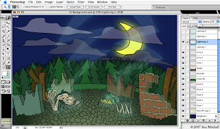
This process takes all the required elements and layers them, using the same principles of traditional cel animation. To prepare a sequence, first of all the layers need to be prepared in Photoshop. This way I can establish which elements of the eventual animated image will remain inanimate, and give each animation layer a name and number for ease of reference. This makes it that much easier to simply bring in the layer you want for the frame you're working on when it comes to the actual animation process. Said process takes place using After Effects, which is also an Adobe application and is consequently hugely compatible with Photoshop. Once the .psd file is imported into the new comp, most scenes are made up of the following:
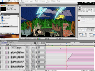
Background - this obviously just sits in the...background...looking pretty and such.
Background animation - occasionally elements of the background move, such as flapping curtains, rainfall, moving clouds etc. Usually this animation will be comped together with the still background image before any character animation begins to avoid clutter, with the exception of certain shots; for example, if someone is standing in the rain then the rainfall layer needs to appear in front of the character, and so it remains separate.
Character(s) - for a large number of shots I'm using limited animation, in the style of those mass-produced Hanna-Barbera cartoons such as The Flinstones or Yogi Bear. In these shots there will inevitably be elements of the character that stay as one still image, ordinarily the torso.
Character animation - these are, as you can probably guess, the other elements of the character that actually move, such as lip-sync, facial expressions/head movement, arm/leg movement, walk-cycles blah blah blah.
Lighting/colour correction - this will usually be an effects layer that, when appropriate, strengthens or mutes the overall colour scheme so that the characters stand out sufficiently from the backgrounds. Lighting effects (for the sake of atmosphere) can also be added in Photoshop and then reimported into After Effects.
So with the process cackhandedly explained, I can show you the fruits of my toil! The animation itself is going to be constantly tweaked (for the better, one hopes) until the film is done and so I've decided to instead show off some stills of the comp results, comparing them to the storyboard visuals. Indulge that voyeur in you and have a cheeky peek:
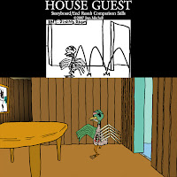
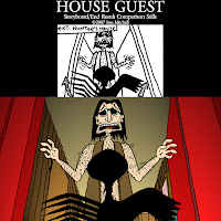
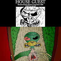
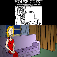
Why, simply delectable, I'm sure you'll agree. Maybe sometime soon I'll be able to show some of the little buggers in motion.

Thursday, 23 August 2007

Backgrounds Part 3 - Not For The Agoraphobics

I have decided to get out of that cabin for some fresh air. Now these backgrounds are a lot more fun to do as they have no reliance on geometry or necessary continuity, so they can be drawn pretty much on-the-fly. A friend of mine, upon seeing these, asked me why there were so many xmas trees in these woods. The sad, simple answer is these are the easiest trees to draw. Truth be told, a lot of cartoonist license has been used when it comes to the flora of the film's setting.

Really the backgrounds here are inspired by the coniferous cranny of the Laurentians that my family hails from, so it isn't a typical British countryside by any stretch. Though if we're nitpicking, ducks don't come back from the dead when struck by lightning either. Anyhizzoo, let's fawn over the purty pictures...


Well that's enough of that. Now get back inside.

Saturday, 18 August 2007

Backgrounds Part 2 - Interior Design

Following up on the last entry, here are a number of finished backgrounds that will appear in the film. These are of the cabin's living room and foyer interiors, which calls for a lots and lots of shaky wooden slats.
For somebody who has been doodling since infancy, I can't draw a straight line for shit. But you can more or less tell what you're looking at and the cruddiness of the lines have a sort of hapless charm. Sort of. While an indulgent part of me misses the nifty look of the wooden textures from when this cabin was originally built, this look is far more visually appropriate so I'll have to put my hat in my hand on that one. The keen of eye might notice that the Hunter has an 'Agnosticaust' poster and a 'Johnny Star' poster in his house. A man of undeniable musical taste.

Tuesday, 14 August 2007

Backgrounds Part 1 - A Happy Medium

In a couple of earlier entries I described the process of constructing sets in a 3D CG environment. This was back when I was still contemplating 3D computer animation as a viable option, before reconciling myself with the fact that the shaky, crude visuals of the hand-drawn concept art suited the film far more. Now that I'm soldiering on with the 2D animation process I've come to the point where I can no longer run from the stage of production I've been putting off: backgrounds.
After analysing the storyboard I've determined that there are roughly eighty (that's not a typo, the 'y' is indeed supposed to be there at the end) background drawings required for the film in its entirety. It brings fucking tears to my eyes. My chief concern is that, while with a fair deal of practice I can create character designs and poses which are consistent with one another, I positively suck at backgrounds if any spacial geometry is involved. Have another look at this kitchen from the concept art:

The colour palette, the wobbly lines and the irreconcilable proportions make it akin to the demented scrawling of an infant drawing with the pen between its teeth. Interestingly, our course leader has consistently argued that such a lack of ability is, in its naïveté, endearing, and fitting with the aesthetic of the characters. Frankly I'm not having any of it. I mean, there's 'charmingly naïve' and then there's just 'patently rubbish'. The other extreme would be the equally unsuitable, shiny-looking 3D background.

This time it's naïve but in an entirely charmless way, though it at least makes sense in terms of proportion. So, what to do? The solution I've decided to go with is pretty obvious - to meet in the middle; Retain the crappy, shaky lines from the concept art as well as the geometric perspectives of the CGI set, discarding the polished textures of the latter and the haphazard, nonsensical alignment of the former. To do this I still get to put my CGI set to good use (so hey, it wasn't a waste of time after all!). Rendering the same image of the CG environment as line art, I print out the result and use the lines as a guide to keep my proportions in check.
That's right, I'm tracing, bitches! And all the while that notorious scene from 'Chasing Amy' is playing in my head. Admittedly it's a bit of a cheeky shortcut, but have a look at the result:
It pretty much does exactly what I was hoping for from the start. It's not too cluttered, the colour scheme is more subdued and it doesn't dominate the frame when there are characters in the foreground. Really, it's there to not necessarily be looked at, but just to let the viewer know where the action is taking place. The best part about using this method is I can then keep using my set and just render out stills from different angles so that the accompanying backgrounds maintain continuity. Here are a few examples:

Technically this background actually messes the continuity up some as the blender has disappeared. Let's just say it's been put away somewhere...

The last background has obviously moved the action on to the adjoining dining room, where the interiors are noticeably different. The next entry will feature more of a look at the cabin's ever-so-manly, rustic interior.

Friday, 3 August 2007

A Laudable Lack of Organisation

My devout professionalism when it comes to the film-making process is...well, non-existent. So I doubt it will come as much of a surprise to anybody to learn that, rather than going through the required layouts logically and methodically, with a sense of order for ease of reference, I've been spewing them out at random. When I've exhausted every conceivable layout and pose from the storyboard I'll be faced with the unenviable task of sorting them all chronologically by scene, then by shot. In creating all this extra work for myself I've come to the conclusion that I am, in fact, a closet masochist. I should just cop to it and start paying some sallow dominatrix to beat me senseless every weekend.
Until I can get together the scrilla to indulge that vice, here are some more examples to show how scattered the whole thing has become:

Two more drawings of the Hunter having gone crazy (a bunch more from this scene were posted here). The latter shot accomodates a double-barreled shotgun being raised into the frame.


These drawings have very little facial detail as they will be silhouetted in the colouring process save for the eyes. To keep the character from going too off-model and unrecognisable without features you can see some consideration has gone into the shape of the head.


Our good friend the Prospective Lay. The pose of her in a seated position was drawn in a manner that allows the character to be placed against two different-angled backgrounds and give the impression that she's shifted her position. Whenever I can cut corners I can, I'm just that crafty.

Hands - they're a bitch to draw on their own, and when they're attached to arms it's even trickier. Lots of erasing, redrawing and staring at my own hand in that position went into these.

That feathery prick of a zombie duck is notable by his absence this time around. Rest assured he'll reappear soon enough...

Sunday, 29 July 2007

More O' The Same

Just a quickie to throw some more examples of poses your way. These are from the earlier scenes around the time the Duck and Hunter first meet:

The Hunter at home, unaware of the turn his life is about to take. I was thinking of throwing in his arms sticking to the sofa leather a little bit as an extra detail.

An upper-body shot that will probably only warrant some hair movement, next to a set-up for a basic profile-view walk cycle

The first reveal of the Duck, although this level of detail will only be glimpsed for a split-second (lightning illuminates the design which is otherwise in silhouette). I'm a glutton for punishment.

The subsequent reaction shot from the Hunter (note that with this drawing and the previous one I've tried out some dodgy POV perspective work). This is probably the only example of symmetry in body language used in the film.

Two befuddled reaction shots from the Hunter as the Duck's more eloquent side emerges.

A fairly standard Hunter pose alongside a setup sketch for a forthcoming challenge: The Duck's 'hop' cycle.

These profile shots can be used for reference on numerous occasions, chiefly in the 'first meeting' scene when the Duck is seemingly threatening the Hunter with violence of some sort, as well as a later kitchen scene in which the two are arguing over a missing calzone.

As a plethora of poses are piling up persistently (heh) I don't imagine it's worth posting up every last one as it would fully engulf the blog. From this point on I'll stick to highlights or layouts for specifically complex sequences and give the more boring ones a miss. It's how I keep things fresh, yo.
'Til next time...

Tuesday, 24 July 2007

An Appropriate State of Mind

Some of you in the UK may have noticed that it's been a little wet of late. Others may be too busy floating through the deluged remnants of the town in which you used to live to be reading this. With some luck Bristol managed to be well-situated for this...situation, although it took me an extra five days to get back home after the trains stopped running out of Cheltenham. This wasn't so much a problem in itself, after all it's nice to get away, I can draw wherever I am and, push come to shove, I can swim. However, when the threat of Cheltenham's water supply being turned off presented itself, I made a hasty exit. I'm a man who likes his toilets in working, flushable condition.
Now that I'm home and dry, literally (derp), I can look back at the last few days' work and acknowledge that my frazzled mindset could only have worked in my favour with these layouts. These are some images from the penultimate scene as previously seen in storyboard and animatic form, in which the Hunter has lost his mind. To make this point clear a lot of the poses are off-model and a little grotesque.


These four are cutaway shots that will be used for reactions to dialogue. There's a distinct increase in stubble and a rockin' case of bed-hair going on, as well as the absence of glasses so that I could throw in some crazy eye-acting.

A reveal of the Hunter in the buff, with some shameless shotgun positioning. Naked + hairy + crazy=funny...as long as it's a cartoon. The proportions of the gun and the relationship between his torso and lower gut are a little off and will need to be redone when it is all inked in.

I hope these have enriched your day. I'm off to run all the taps and flush the toilet repeatedly while laughing manically, for no reason other than I CAN. See ya later.

Friday, 20 July 2007

What A Poseur

What is it precisely that you feel you need to make your day complete? If your answer was anything other than 'Why, to see more of Ben Mitchell's poses and layouts for his film, obviously!' then prepare to be bitterly disappointed.
It's called 'life', chump, get used to it.
However, if that was your answer then get ready to squirm and writhe with unrestrained glee, as that's exactly what you're gonna get! Isn't life grand? Here are a selection from the 'Prospective Lay' scene:

Setting up a walk-cycle, fiendishly framed so that no leg-work will be required.

These three are stand-alone cutaway shots designed to show the Hunter's increasing anticipation of bedding his ditzy gal, and his horror at being cockblocked when the Duck moves in on her

A number of sequences will come from this one, with and without the presence of the Duck, who'll be brought in as a separate layer. Proving that anything can look cute if you can make its eyes (or, this case, eye) big and tearful.

The slightly mismatched proportions of the Prospective Lay's head/body are done to accomodate two differently-framed shots (one of her face and the other of the Duck). I'm pretty proud of the not-so-subtle boob-nuzzling in this sketch and the one previous. It took a lot of trial and erasing to get right. Welcome to my life.

Tuesday, 17 July 2007

Mitchell's In England...Again

I've been on vacation since the near-end of June, which is virtually impossible for me. The process of switching off, winding down and 'relaxing' is never as smooth or comfortable as it sounds. Time to myself with nothing to do but while away the hours conferring with the flowers (and, I dare say, consulting with the rain) is a lovely concept, but after half an hour the grim spectre of my duck zombie manifests in my mind's eye. "Get back to work, you fucking layabout!" It hoarsely barks at me, "And get a girlfriend while you're at it - you're twenty-three years old, for chrissakes!"
While the Laurentians don't boast many sprightly young females with unaccountably low standards, they do make for an ideal setting to get work done without feeling like you're doing so. As such I returned to the UK with a full production schedule that takes me through to September, the main job for the remainder of July being the surprisingly enjoyable task of creating full-scale poses and layouts which can later be used as visual references for the eventual animation. These are more-or-less reproductions of certain parts of the storyboard artwork, and as they are intended to be rough visual guides they aren't cleaned-up or inked in. To start with, here are a handful from the first two scenes:

Each sketch incorporates both the still elements and an indication of the moving elements, which will be layered separately when properly animated. For example, the Kid's body and the rocks will stay still, while the fish and the Kid's face will have some movement.

This layout accomodates a shot that pans upward, starting with the Kid's legs that walk into shot, going up to reveal his face.

This pic is a set-up for a 'take' (a surprised reaction, when the Kid realises the seemingly-dead Duck has flown away), starting with an initially deadpan expression for emphasis.

A proportional sketch for two shots of the pre-zombie Duck in silhouette (so there's no real detail included, we never see him properly until after his zombification...I think that's a word), one in which the Duck is swimming, the other for when he is mounted which includes the legs.

I've got loads of these to do, so expect a whole heap posted up here the next couple weeks. It's all incrementally coming together...