For the penultimate scene we start off on the upstairs landing which has remained previously unseen. This setting leads to a sort of payoff sequence where the Duck is chased down the hallway and up the stairs into the attic, which will involve a simulated tracking shot using either CGI or rotoscoping. That nightmarish proposition I'm not quite ready for, but here are some of the still backgrounds. 


Monday, 24 September 2007
Tuesday, 18 September 2007
Hop, you mangy Anatidae!
In the last post I talked about using limited animation, wherein certain elements of the characters move while others stay the same. For this cycle I'm using full animation, which means that every frame of animation is a completely separate drawing. Starting off with, here's a six-frame hop cycle of the Duck in construction line form:

It's brief but it does what it needs to. This is for a scene in which the Duck pitifully hops away into the night, guilt-tripping the Hunter into offering a place to stay. I wanted the hops to be quick and painful looking.

Then each frame is detailed and tested again, to make sure that the animation still flows with the extra embellishment.

In the future I probably won't add as much detail at this point as I have here.

Next is the cleanup, which sees me trace over the pencil drawings in pen.

So then we colour it all in using Photoshop...

And hey presto!

The only worrying thing is it took me three hours to work this out and get it done. My course leader assures me that my production speed will get faster, which I hope will be the case. If I maintain a working pace of three hours per half-second, I'll be working on this film until 2015.
It's brief but it does what it needs to. This is for a scene in which the Duck pitifully hops away into the night, guilt-tripping the Hunter into offering a place to stay. I wanted the hops to be quick and painful looking.
Then each frame is detailed and tested again, to make sure that the animation still flows with the extra embellishment.
In the future I probably won't add as much detail at this point as I have here.
Next is the cleanup, which sees me trace over the pencil drawings in pen.
So then we colour it all in using Photoshop...
And hey presto!
The only worrying thing is it took me three hours to work this out and get it done. My course leader assures me that my production speed will get faster, which I hope will be the case. If I maintain a working pace of three hours per half-second, I'll be working on this film until 2015.
Labels:
animation,
cleanup,
colouring,
cycles,
house guest,
line test,
zombie duck
Tuesday, 11 September 2007
The cyclical nature of things
As I have brought up previously, this film is going to incorporate both limited animation and full animation. To demonstrate the key differences between the two I'm drawing upon that old animation staple of cycles, those wondrous sequences that can be looped over and over again. In this entry I'm going to talk about two examples of limited animation - what I've marked out as the 'flight cycle'.
Near the end of the film we find out that the Duck is not nearly as lame and crippled as he has made out to be, in fact he's fully capable of taking flight. These sequences are for when he's being chased around the house by the shotgun-toting Hunter.
First of all a layout drawing - essentially a more detailed version of the visual created in the storyboard - is created, upon which the animation is based. This gives an indication of which elements of the character will move and which will remain motionless. Limited animation does this a lot to save the time of having to draw a different image for each frame of animation. Once it is established that the only moving elements of the Duck will be its wings, careful consideration goes into the flapping motion to make it seem (loosely) realistic.
If a bird is flying it'll raise the wings up with a bend at the joint, bringing the rest up as secondary motion, then at a faster speed it will bring them down with the same bend, this time inverted. This is the first test when all the layers are coloured, scanned and comped:

Given that I am animating on twos (12.5 frames per second as opposed to 25) I inadvertently have put too much in-betweening in, so at this stage the movement is too slow. It's easy enough to fix, by dropping the unnecessary frames the cycle will go quicker, and by applying additional movement to the comped animation I can have the Duck be propelled upward slightly when the wings come down, then have him descend a little when they go up.

There is still some tweaking to be done, and with this additional motion perhaps the need for some kick animation on his remaining leg. Intents and purposes we're more or less there.
I want to cover this flying sequence from two angles, so I need to replicate this cycle but viewed from the side. It's fairly easy as I can just use the corresponding frames of the original cycle as a reference. As this is a not-quite-profile shot, it makes sense to first do a line test.

This basically shows how the animation-in-progress looks in construction-line form, so I know whether or not the movement works before I spend too much time adding detail. This is a crucial stage to get right, as you can have a finished drawing look amazing but it'll be rubbish if it doesn't move well. After a successful line test has given me the green light to go ahead, I can add detail, ink and colour to get this:

As you can see I have added some additional facial animation that is independent of the wing cycle, but the main body stays the same drawing throughout.
So, there's some limited animation for you. Next entry I'll move on to the more laborious stuff...
Near the end of the film we find out that the Duck is not nearly as lame and crippled as he has made out to be, in fact he's fully capable of taking flight. These sequences are for when he's being chased around the house by the shotgun-toting Hunter.
First of all a layout drawing - essentially a more detailed version of the visual created in the storyboard - is created, upon which the animation is based. This gives an indication of which elements of the character will move and which will remain motionless. Limited animation does this a lot to save the time of having to draw a different image for each frame of animation. Once it is established that the only moving elements of the Duck will be its wings, careful consideration goes into the flapping motion to make it seem (loosely) realistic.
If a bird is flying it'll raise the wings up with a bend at the joint, bringing the rest up as secondary motion, then at a faster speed it will bring them down with the same bend, this time inverted. This is the first test when all the layers are coloured, scanned and comped:
Given that I am animating on twos (12.5 frames per second as opposed to 25) I inadvertently have put too much in-betweening in, so at this stage the movement is too slow. It's easy enough to fix, by dropping the unnecessary frames the cycle will go quicker, and by applying additional movement to the comped animation I can have the Duck be propelled upward slightly when the wings come down, then have him descend a little when they go up.
There is still some tweaking to be done, and with this additional motion perhaps the need for some kick animation on his remaining leg. Intents and purposes we're more or less there.
I want to cover this flying sequence from two angles, so I need to replicate this cycle but viewed from the side. It's fairly easy as I can just use the corresponding frames of the original cycle as a reference. As this is a not-quite-profile shot, it makes sense to first do a line test.
This basically shows how the animation-in-progress looks in construction-line form, so I know whether or not the movement works before I spend too much time adding detail. This is a crucial stage to get right, as you can have a finished drawing look amazing but it'll be rubbish if it doesn't move well. After a successful line test has given me the green light to go ahead, I can add detail, ink and colour to get this:
As you can see I have added some additional facial animation that is independent of the wing cycle, but the main body stays the same drawing throughout.
So, there's some limited animation for you. Next entry I'll move on to the more laborious stuff...
Labels:
flight cycles,
house guest,
limited animation,
line test,
zombie duck
Saturday, 8 September 2007
Tuesday, 4 September 2007
The Ol' Compin' Grounds
Well, it's all coming gradually together. I've slogged through the arduous labour of scripwriting, trudged through the septic waters of storyboarding, lapped up the murky mildew of layouts and background design, scratched at the itchy scabbiness of the colouring process and after all those questionable metaphors I'm now able to comp it all together! Well, not all, but a fair old chunk at least.
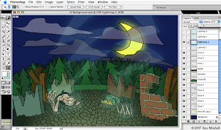
This process takes all the required elements and layers them, using the same principles of traditional cel animation. To prepare a sequence, first of all the layers need to be prepared in Photoshop. This way I can establish which elements of the eventual animated image will remain inanimate, and give each animation layer a name and number for ease of reference. This makes it that much easier to simply bring in the layer you want for the frame you're working on when it comes to the actual animation process.

Said process takes place using After Effects, which is also an Adobe application and is consequently hugely compatible with Photoshop. Once the .psd file is imported into the new comp, most scenes are made up of the following:
Background - this obviously just sits in the...background...looking pretty and such.
Background animation - occasionally elements of the background move, such as flapping curtains, rainfall, moving clouds etc. Usually this animation will be comped together with the still background image before any character animation begins to avoid clutter, with the exception of certain shots; for example, if someone is standing in the rain then the rainfall layer needs to appear in front of the character, and so it remains separate.
Character(s) - for a large number of shots I'm using limited animation, in the style of those mass-produced Hanna-Barbera cartoons such as The Flinstones or Yogi Bear. In these shots there will inevitably be elements of the character that stay as one still image, ordinarily the torso.
Character animation - these are, as you can probably guess, the other elements of the character that actually move, such as lip-sync, facial expressions/head movement, arm/leg movement, walk-cycles blah blah blah.
Lighting/colour correction - this will usually be an effects layer that, when appropriate, strengthens or mutes the overall colour scheme so that the characters stand out sufficiently from the backgrounds. Lighting effects (for the sake of atmosphere) can also be added in Photoshop and then reimported into After Effects.
So with the process cackhandedly explained, I can show you the fruits of my toil! The animation itself is going to be constantly tweaked (for the better, one hopes) until the film is done and so I've decided to instead show off some stills of the comp results, comparing them to the storyboard visuals. Indulge that voyeur in you and have a cheeky peek:
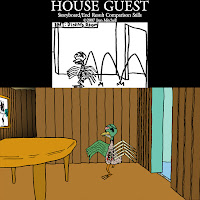
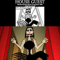
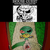
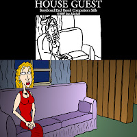
Why, simply delectable, I'm sure you'll agree. Maybe sometime soon I'll be able to show some of the little buggers in motion.
This process takes all the required elements and layers them, using the same principles of traditional cel animation. To prepare a sequence, first of all the layers need to be prepared in Photoshop. This way I can establish which elements of the eventual animated image will remain inanimate, and give each animation layer a name and number for ease of reference. This makes it that much easier to simply bring in the layer you want for the frame you're working on when it comes to the actual animation process.
Said process takes place using After Effects, which is also an Adobe application and is consequently hugely compatible with Photoshop. Once the .psd file is imported into the new comp, most scenes are made up of the following:Background - this obviously just sits in the...background...looking pretty and such.
Background animation - occasionally elements of the background move, such as flapping curtains, rainfall, moving clouds etc. Usually this animation will be comped together with the still background image before any character animation begins to avoid clutter, with the exception of certain shots; for example, if someone is standing in the rain then the rainfall layer needs to appear in front of the character, and so it remains separate.
Character(s) - for a large number of shots I'm using limited animation, in the style of those mass-produced Hanna-Barbera cartoons such as The Flinstones or Yogi Bear. In these shots there will inevitably be elements of the character that stay as one still image, ordinarily the torso.
Character animation - these are, as you can probably guess, the other elements of the character that actually move, such as lip-sync, facial expressions/head movement, arm/leg movement, walk-cycles blah blah blah.
Lighting/colour correction - this will usually be an effects layer that, when appropriate, strengthens or mutes the overall colour scheme so that the characters stand out sufficiently from the backgrounds. Lighting effects (for the sake of atmosphere) can also be added in Photoshop and then reimported into After Effects.
So with the process cackhandedly explained, I can show you the fruits of my toil! The animation itself is going to be constantly tweaked (for the better, one hopes) until the film is done and so I've decided to instead show off some stills of the comp results, comparing them to the storyboard visuals. Indulge that voyeur in you and have a cheeky peek:


Why, simply delectable, I'm sure you'll agree. Maybe sometime soon I'll be able to show some of the little buggers in motion.
Labels:
adobe,
after effects,
comp,
house guest,
photoshop,
stills,
Storyboard,
uwe
Thursday, 23 August 2007
Backgrounds Part 3 - Not For The Agoraphobics
I have decided to get out of that cabin for some fresh air. Now these backgrounds are a lot more fun to do as they have no reliance on geometry or necessary continuity, so they can be drawn pretty much on-the-fly. A friend of mine, upon seeing these, asked me why there were so many xmas trees in these woods. The sad, simple answer is these are the easiest trees to draw. Truth be told, a lot of cartoonist license has been used when it comes to the flora of the film's setting.
Really the backgrounds here are inspired by the coniferous cranny of the Laurentians that my family hails from, so it isn't a typical British countryside by any stretch. Though if we're nitpicking, ducks don't come back from the dead when struck by lightning either. Anyhizzoo, let's fawn over the purty pictures...


Well that's enough of that. Now get back inside.
Really the backgrounds here are inspired by the coniferous cranny of the Laurentians that my family hails from, so it isn't a typical British countryside by any stretch. Though if we're nitpicking, ducks don't come back from the dead when struck by lightning either. Anyhizzoo, let's fawn over the purty pictures...
Labels:
animation,
backgrounds,
exteriors,
house guest,
ma,
uwe
Saturday, 18 August 2007
Backgrounds Part 2 - Interior Design
Following up on the last entry, here are a number of finished backgrounds that will appear in the film. These are of the cabin's living room and foyer interiors, which calls for a lots and lots of shaky wooden slats. 


For somebody who has been doodling since infancy, I can't draw a straight line for shit. But you can more or less tell what you're looking at and the cruddiness of the lines have a sort of hapless charm. Sort of. While an indulgent part of me misses the nifty look of the wooden textures from when this cabin was originally built, this look is far more visually appropriate so I'll have to put my hat in my hand on that one. The keen of eye might notice that the Hunter has an 'Agnosticaust' poster and a 'Johnny Star' poster in his house. A man of undeniable musical taste.
Tuesday, 14 August 2007
Backgrounds Part 1 - A Happy Medium
In a couple of earlier entries I described the process of constructing sets in a 3D CG environment. This was back when I was still contemplating 3D computer animation as a viable option, before reconciling myself with the fact that the shaky, crude visuals of the hand-drawn concept art suited the film far more. Now that I'm soldiering on with the 2D animation process I've come to the point where I can no longer run from the stage of production I've been putting off: backgrounds.
After analysing the storyboard I've determined that there are roughly eighty (that's not a typo, the 'y' is indeed supposed to be there at the end) background drawings required for the film in its entirety. It brings fucking tears to my eyes. My chief concern is that, while with a fair deal of practice I can create character designs and poses which are consistent with one another, I positively suck at backgrounds if any spacial geometry is involved. Have another look at this kitchen from the concept art:
The colour palette, the wobbly lines and the irreconcilable proportions make it akin to the demented scrawling of an infant drawing with the pen between its teeth. Interestingly, our course leader has consistently argued that such a lack of ability is, in its naïveté, endearing, and fitting with the aesthetic of the characters. Frankly I'm not having any of it. I mean, there's 'charmingly naïve' and then there's just 'patently rubbish'. The other extreme would be the equally unsuitable, shiny-looking 3D background.
This time it's naïve but in an entirely charmless way, though it at least makes sense in terms of proportion. So, what to do? The solution I've decided to go with is pretty obvious - to meet in the middle; Retain the crappy, shaky lines from the concept art as well as the geometric perspectives of the CGI set, discarding the polished textures of the latter and the haphazard, nonsensical alignment of the former. To do this I still get to put my CGI set to good use (so hey, it wasn't a waste of time after all!). Rendering the same image of the CG environment as line art, I print out the result and use the lines as a guide to keep my proportions in check.
That's right, I'm tracing, bitches! And all the while that notorious scene from 'Chasing Amy' is playing in my head. Admittedly it's a bit of a cheeky shortcut, but have a look at the result:
It pretty much does exactly what I was hoping for from the start. It's not too cluttered, the colour scheme is more subdued and it doesn't dominate the frame when there are characters in the foreground. Really, it's there to not necessarily be looked at, but just to let the viewer know where the action is taking place. The best part about using this method is I can then keep using my set and just render out stills from different angles so that the accompanying backgrounds maintain continuity. Here are a few examples:

The last background has obviously moved the action on to the adjoining dining room, where the interiors are noticeably different. The next entry will feature more of a look at the cabin's ever-so-manly, rustic interior.
After analysing the storyboard I've determined that there are roughly eighty (that's not a typo, the 'y' is indeed supposed to be there at the end) background drawings required for the film in its entirety. It brings fucking tears to my eyes. My chief concern is that, while with a fair deal of practice I can create character designs and poses which are consistent with one another, I positively suck at backgrounds if any spacial geometry is involved. Have another look at this kitchen from the concept art:
That's right, I'm tracing, bitches! And all the while that notorious scene from 'Chasing Amy' is playing in my head. Admittedly it's a bit of a cheeky shortcut, but have a look at the result:
Technically this background actually messes the continuity up some as the blender has disappeared. Let's just say it's been put away somewhere...
Friday, 3 August 2007
A Laudable Lack of Organisation
My devout professionalism when it comes to the film-making process is...well, non-existent. So I doubt it will come as much of a surprise to anybody to learn that, rather than going through the required layouts logically and methodically, with a sense of order for ease of reference, I've been spewing them out at random. When I've exhausted every conceivable layout and pose from the storyboard I'll be faced with the unenviable task of sorting them all chronologically by scene, then by shot. In creating all this extra work for myself I've come to the conclusion that I am, in fact, a closet masochist. I should just cop to it and start paying some sallow dominatrix to beat me senseless every weekend.
Until I can get together the scrilla to indulge that vice, here are some more examples to show how scattered the whole thing has become:
That feathery prick of a zombie duck is notable by his absence this time around. Rest assured he'll reappear soon enough...
Labels:
house guest,
hunter,
layouts,
poses,
prospective lay,
uwe
Subscribe to:
Posts (Atom)


