

Saturday, 20 October 2007
At last we get some nudity!
Well, I kept my word, because that's just the kind of guy I am. Shame about all the other horrible facets of my personality though. Anyways:


Tuesday, 16 October 2007
Bedfellows
Having described the fundamentals of the animation process for my film, it has in some ways eliminated the need for continuous blogging. What I am currently working on are sequences that all draw upon the limited and full animation described in prior posts, so with that knowledge in mind all I could really talk about at this point is the deconstruction of each scene and shot as they are being worked on. Truthfully, that would be boring, not to mention that it would suck out a lot of the soul of the film.
So, until I move on to other processes, I'll just post some more storyboard/end result comparisons, just to give you more of a flavour of things, and to prove that I'm still getting stuff done.To start with, here's a layout for a brief scene in which the Hunter finally snaps when lying in bed. It's a fairly simple sequence - panning around the bedroom until we zoom in on the Hunter's face. The entire layout was done on A3 to allow for more background detail:

Here's the inked-in version, with more details (such as cement between the bricks) and definition:

And here's how the final shot will look at 16:9 and in colour, compared to the original storyboard sketch. If you look closely you can see that the Hunter has been redrawn with more detail as a separate layer, so that the line quality doesn't deteriorate so much when the shot closes in:
 For now that's the only interesting thing I've got for y'all. There'll be more, I swear!
So, until I move on to other processes, I'll just post some more storyboard/end result comparisons, just to give you more of a flavour of things, and to prove that I'm still getting stuff done.To start with, here's a layout for a brief scene in which the Hunter finally snaps when lying in bed. It's a fairly simple sequence - panning around the bedroom until we zoom in on the Hunter's face. The entire layout was done on A3 to allow for more background detail:

Here's the inked-in version, with more details (such as cement between the bricks) and definition:

And here's how the final shot will look at 16:9 and in colour, compared to the original storyboard sketch. If you look closely you can see that the Hunter has been redrawn with more detail as a separate layer, so that the line quality doesn't deteriorate so much when the shot closes in:
 For now that's the only interesting thing I've got for y'all. There'll be more, I swear!
Thursday, 4 October 2007
Case Study: "Float over here so I can punch you"
 If I were to do the fair thing and disregard the Super Mario franchise, my two fondest memories of playing video games as an adorable whippersnapper also happened to be, in their own way, two of my biggest creative and stylistic influences (in visual terms). This is no doubt because they themselves were inspired by the classic, manic era of animation that hit its stride in 40s and 50s. 'The Simpsons' had reminded the world that cartoons could be smart and dialogue-driven, 'Ren & Stimpy' had reminded the world that they could be insane and unrestrained. This renewed interest in animation during the early 90s bled into some video games which had, by good fortune, just about reached a level of technological sophistication that accommodated it. One such game was 'Earthworm Jim', which at some point I'd like to devote a separate entry to. The game that ever-so-slightly trumps it was a revelation to a lot of console-oriented videogamers like myself at the time.
 'Day Of The Tentacle' (a 1993 sequel to the 1987 game 'Maniac Mansion' which had already become an old chestnut) was one of the earliest examples of a point-and-click adventure that was, essentially, an interactive cartoon. To a nine-year-old this was a truly wondrous concept, and in my not-quite-adulthood it has dated surprisingly well, for a number of reasons:
- It isn't easy, but that being said I have the entire walkthrough eerily memorised to this day. I say 'eerily' because I can't even remember what I ate for breakfast yesterday.
- It's still pretty funny, for not necessarily the same reasons, but lines like 'Ted is red, see red Ted' still keep me a-chucklin' like the silly bitch I am. At the time to just have the characters speak at all was brilliant enough.
- The excellent sprite animation, obviously the more pertinent aspect in the context of this journal. Clearly a love letter to Tex Avery, Chuck Jones and that whole rat pack, it featured superb character acting, fluid motion and some nice dashes of craziness. The background paintings were especially gorgeous to look at in all their pixellated glory.
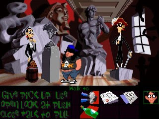 The premise was fittingly nonsensical, referring to exposition set up in 'Maniac Mansion' (which I never got through) the player switches between three college students who explore the same building in the past, present and future respectively. The gameplay involves using one, two or all three characters to solve a series of bizarre puzzles - an example of the abstract thinking required being: the guy in the past needs vinegar to help power a battery, so he has wine transported from the present which he then seals in a time capsule. The girl in the future then has to locate the capsule, open it and send the bottle of what-has-now-become vinegar back to the past. Seriously, you needed that walkthrough...
 As with any successful cartoon, the characters were endearing and nicely developed - Bernard, a booksmart sort-of-leader; Hoagie, an overweight, hairy music enthusiast who I seem to have alarmingly morphed into; and Laverne, who is either baked or semi-retarded - either way every girl I wound up dating has reminded me a little of her. I guess this game seeped into my life in many ways.
  The supporting characters were also well-conceived. The family of villains from the previous game are now semi-allies, although in 'Tentacle' you cannot die, so pretty much all the characters have some function or other that you need to harness to move the story along. They are essentially props with well-written dialogue.
Another crucial contributor to the game's overall environment - as, again, with any decent cartoon - was the music, which was expertly orchestrated and timed, and yet the factor that dates the game the most (it is a feast for the ears if you can get passed it being General MIDI).
It's tempting to simply list all the quotable dialogue, ingeniously-crafted puzzles and twists that made the game such a work of art, but neither you nor I have that kind of time. Well, okay, you probably don't. However, thanks to that ever-resourceful archive of pop-culture that is YouTube, here are some clips I found:
It's tempting to simply list all the quotable dialogue, ingeniously-crafted puzzles and twists that made the game such a work of art, but neither you nor I have that kind of time. Well, okay, you probably don't. However, thanks to that ever-resourceful archive of pop-culture that is YouTube, here are some clips I found:
As a sidenote, I'm glad that these are mostly clips from playing as Laverne as she was my favourite. I'm not sure whether the voice actress's monotone reading of her dialogue was deliberate or because she was just awful. Either way, it's brilliant. The (sadly absent in these clips) highlights of her performance would be the occasional manic giggling she'd launch into apropos of absolutely nothing. But I digress...
 This game was a huge influence on 'Mitchells In England', if for no other reason than it sparked a desire to create my own cartoon universe with my own characters. Eventually when I got my sea-legs, drawing-wise, a lot of visual derivations started to appear. This has also been the case with 'House Guest', and as I get more comfortable with the animation process and the urge to get a little ambitious with it, I find myself reminded more and more of 'Tentacle'. It has me wondering whether my generation would be the first to actually count video games as a legitimate creative influence. It also makes me a little sad that polygonal, 3D gaming took over so shortly afterward and the marriage of traditional 2D animation and the gaming world never really developed far beyond the 16-bit era. Frankly it's a little jarring that things I hold dear to my heart from my childhood are already being dismissed as passé - shit, I didn't think it'd happen so soon...
Thanks then to the basement geeks who developed console emulators and ScummVM. I can stay mired in the past indefinitely! If the game can be located, I'd urge anyone with an interest in animation history to give it a whirl. I honestly consider it to be a frequently-overlooked milestone.
 And 'Sam & Max' wasn't too shabby either.
And 'Sam & Max' wasn't too shabby either.Monday, 24 September 2007
Backgrounds Part 4 - Let's Go Upstairs
For the penultimate scene we start off on the upstairs landing which has remained previously unseen. This setting leads to a sort of payoff sequence where the Duck is chased down the hallway and up the stairs into the attic, which will involve a simulated tracking shot using either CGI or rotoscoping. That nightmarish proposition I'm not quite ready for, but here are some of the still backgrounds. 


Tuesday, 18 September 2007
Hop, you mangy Anatidae!
In the last post I talked about using limited animation, wherein certain elements of the characters move while others stay the same. For this cycle I'm using full animation, which means that every frame of animation is a completely separate drawing. Starting off with, here's a six-frame hop cycle of the Duck in construction line form:

It's brief but it does what it needs to. This is for a scene in which the Duck pitifully hops away into the night, guilt-tripping the Hunter into offering a place to stay. I wanted the hops to be quick and painful looking.

Then each frame is detailed and tested again, to make sure that the animation still flows with the extra embellishment.

In the future I probably won't add as much detail at this point as I have here.

Next is the cleanup, which sees me trace over the pencil drawings in pen.

So then we colour it all in using Photoshop...

And hey presto!

The only worrying thing is it took me three hours to work this out and get it done. My course leader assures me that my production speed will get faster, which I hope will be the case. If I maintain a working pace of three hours per half-second, I'll be working on this film until 2015.
It's brief but it does what it needs to. This is for a scene in which the Duck pitifully hops away into the night, guilt-tripping the Hunter into offering a place to stay. I wanted the hops to be quick and painful looking.
Then each frame is detailed and tested again, to make sure that the animation still flows with the extra embellishment.
In the future I probably won't add as much detail at this point as I have here.
Next is the cleanup, which sees me trace over the pencil drawings in pen.
So then we colour it all in using Photoshop...
And hey presto!
The only worrying thing is it took me three hours to work this out and get it done. My course leader assures me that my production speed will get faster, which I hope will be the case. If I maintain a working pace of three hours per half-second, I'll be working on this film until 2015.
Tuesday, 11 September 2007
The cyclical nature of things
As I have brought up previously, this film is going to incorporate both limited animation and full animation. To demonstrate the key differences between the two I'm drawing upon that old animation staple of cycles, those wondrous sequences that can be looped over and over again. In this entry I'm going to talk about two examples of limited animation - what I've marked out as the 'flight cycle'.
Near the end of the film we find out that the Duck is not nearly as lame and crippled as he has made out to be, in fact he's fully capable of taking flight. These sequences are for when he's being chased around the house by the shotgun-toting Hunter.
First of all a layout drawing - essentially a more detailed version of the visual created in the storyboard - is created, upon which the animation is based. This gives an indication of which elements of the character will move and which will remain motionless. Limited animation does this a lot to save the time of having to draw a different image for each frame of animation. Once it is established that the only moving elements of the Duck will be its wings, careful consideration goes into the flapping motion to make it seem (loosely) realistic.
If a bird is flying it'll raise the wings up with a bend at the joint, bringing the rest up as secondary motion, then at a faster speed it will bring them down with the same bend, this time inverted. This is the first test when all the layers are coloured, scanned and comped:

Given that I am animating on twos (12.5 frames per second as opposed to 25) I inadvertently have put too much in-betweening in, so at this stage the movement is too slow. It's easy enough to fix, by dropping the unnecessary frames the cycle will go quicker, and by applying additional movement to the comped animation I can have the Duck be propelled upward slightly when the wings come down, then have him descend a little when they go up.

There is still some tweaking to be done, and with this additional motion perhaps the need for some kick animation on his remaining leg. Intents and purposes we're more or less there.
I want to cover this flying sequence from two angles, so I need to replicate this cycle but viewed from the side. It's fairly easy as I can just use the corresponding frames of the original cycle as a reference. As this is a not-quite-profile shot, it makes sense to first do a line test.

This basically shows how the animation-in-progress looks in construction-line form, so I know whether or not the movement works before I spend too much time adding detail. This is a crucial stage to get right, as you can have a finished drawing look amazing but it'll be rubbish if it doesn't move well. After a successful line test has given me the green light to go ahead, I can add detail, ink and colour to get this:

As you can see I have added some additional facial animation that is independent of the wing cycle, but the main body stays the same drawing throughout.
So, there's some limited animation for you. Next entry I'll move on to the more laborious stuff...
Near the end of the film we find out that the Duck is not nearly as lame and crippled as he has made out to be, in fact he's fully capable of taking flight. These sequences are for when he's being chased around the house by the shotgun-toting Hunter.
First of all a layout drawing - essentially a more detailed version of the visual created in the storyboard - is created, upon which the animation is based. This gives an indication of which elements of the character will move and which will remain motionless. Limited animation does this a lot to save the time of having to draw a different image for each frame of animation. Once it is established that the only moving elements of the Duck will be its wings, careful consideration goes into the flapping motion to make it seem (loosely) realistic.
If a bird is flying it'll raise the wings up with a bend at the joint, bringing the rest up as secondary motion, then at a faster speed it will bring them down with the same bend, this time inverted. This is the first test when all the layers are coloured, scanned and comped:
Given that I am animating on twos (12.5 frames per second as opposed to 25) I inadvertently have put too much in-betweening in, so at this stage the movement is too slow. It's easy enough to fix, by dropping the unnecessary frames the cycle will go quicker, and by applying additional movement to the comped animation I can have the Duck be propelled upward slightly when the wings come down, then have him descend a little when they go up.
There is still some tweaking to be done, and with this additional motion perhaps the need for some kick animation on his remaining leg. Intents and purposes we're more or less there.
I want to cover this flying sequence from two angles, so I need to replicate this cycle but viewed from the side. It's fairly easy as I can just use the corresponding frames of the original cycle as a reference. As this is a not-quite-profile shot, it makes sense to first do a line test.
This basically shows how the animation-in-progress looks in construction-line form, so I know whether or not the movement works before I spend too much time adding detail. This is a crucial stage to get right, as you can have a finished drawing look amazing but it'll be rubbish if it doesn't move well. After a successful line test has given me the green light to go ahead, I can add detail, ink and colour to get this:
As you can see I have added some additional facial animation that is independent of the wing cycle, but the main body stays the same drawing throughout.
So, there's some limited animation for you. Next entry I'll move on to the more laborious stuff...
Saturday, 8 September 2007
More Stills!
Pretty much what it says on the tin. Figured I'd throw up some more comparitive examples of shots as conceived whilst storyboarding next to how they'll look in the finished film. Check 'em out, y'all: 


Tuesday, 4 September 2007
The Ol' Compin' Grounds
Well, it's all coming gradually together. I've slogged through the arduous labour of scripwriting, trudged through the septic waters of storyboarding, lapped up the murky mildew of layouts and background design, scratched at the itchy scabbiness of the colouring process and after all those questionable metaphors I'm now able to comp it all together! Well, not all, but a fair old chunk at least.
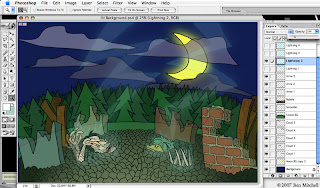 This process takes all the required elements and layers them, using the same principles of traditional cel animation. To prepare a sequence, first of all the layers need to be prepared in Photoshop. This way I can establish which elements of the eventual animated image will remain inanimate, and give each animation layer a name and number for ease of reference. This makes it that much easier to simply bring in the layer you want for the frame you're working on when it comes to the actual animation process.
  Said process takes place using After Effects, which is also an Adobe application and is consequently hugely compatible with Photoshop. Once the .psd file is imported into the new comp, most scenes are made up of the following:
Background - this obviously just sits in the...background...looking pretty and such.
Background animation - occasionally elements of the background move, such as flapping curtains, rainfall, moving clouds etc. Usually this animation will be comped together with the still background image before any character animation begins to avoid clutter, with the exception of certain shots; for example, if someone is standing in the rain then the rainfall layer needs to appear in front of the character, and so it remains separate.
Character(s) - for a large number of shots I'm using limited animation, in the style of those mass-produced Hanna-Barbera cartoons such as The Flinstones or Yogi Bear. In these shots there will inevitably be elements of the character that stay as one still image, ordinarily the torso.
Character animation - these are, as you can probably guess, the other elements of the character that actually move, such as lip-sync, facial expressions/head movement, arm/leg movement, walk-cycles blah blah blah.
Lighting/colour correction - this will usually be an effects layer that, when appropriate, strengthens or mutes the overall colour scheme so that the characters stand out sufficiently from the backgrounds. Lighting effects (for the sake of atmosphere) can also be added in Photoshop and then reimported into After Effects.
So with the process cackhandedly explained, I can show you the fruits of my toil! The animation itself is going to be constantly tweaked (for the better, one hopes) until the film is done and so I've decided to instead show off some stills of the comp results, comparing them to the storyboard visuals. Indulge that voyeur in you and have a cheeky peek:
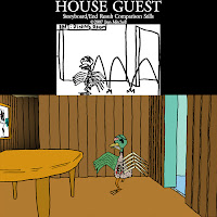
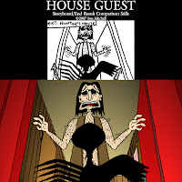
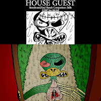
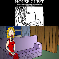 Why, simply delectable, I'm sure you'll agree. Maybe sometime soon I'll be able to show some of the little buggers in motion.
 This process takes all the required elements and layers them, using the same principles of traditional cel animation. To prepare a sequence, first of all the layers need to be prepared in Photoshop. This way I can establish which elements of the eventual animated image will remain inanimate, and give each animation layer a name and number for ease of reference. This makes it that much easier to simply bring in the layer you want for the frame you're working on when it comes to the actual animation process.
  Said process takes place using After Effects, which is also an Adobe application and is consequently hugely compatible with Photoshop. Once the .psd file is imported into the new comp, most scenes are made up of the following:
Background - this obviously just sits in the...background...looking pretty and such.
Background animation - occasionally elements of the background move, such as flapping curtains, rainfall, moving clouds etc. Usually this animation will be comped together with the still background image before any character animation begins to avoid clutter, with the exception of certain shots; for example, if someone is standing in the rain then the rainfall layer needs to appear in front of the character, and so it remains separate.
Character(s) - for a large number of shots I'm using limited animation, in the style of those mass-produced Hanna-Barbera cartoons such as The Flinstones or Yogi Bear. In these shots there will inevitably be elements of the character that stay as one still image, ordinarily the torso.
Character animation - these are, as you can probably guess, the other elements of the character that actually move, such as lip-sync, facial expressions/head movement, arm/leg movement, walk-cycles blah blah blah.
Lighting/colour correction - this will usually be an effects layer that, when appropriate, strengthens or mutes the overall colour scheme so that the characters stand out sufficiently from the backgrounds. Lighting effects (for the sake of atmosphere) can also be added in Photoshop and then reimported into After Effects.
So with the process cackhandedly explained, I can show you the fruits of my toil! The animation itself is going to be constantly tweaked (for the better, one hopes) until the film is done and so I've decided to instead show off some stills of the comp results, comparing them to the storyboard visuals. Indulge that voyeur in you and have a cheeky peek:


 Why, simply delectable, I'm sure you'll agree. Maybe sometime soon I'll be able to show some of the little buggers in motion.
Thursday, 23 August 2007
Backgrounds Part 3 - Not For The Agoraphobics
I have decided to get out of that cabin for some fresh air. Now these backgrounds are a lot more fun to do as they have no reliance on geometry or necessary continuity, so they can be drawn pretty much on-the-fly. A friend of mine, upon seeing these, asked me why there were so many xmas trees in these woods. The sad, simple answer is these are the easiest trees to draw. Truth be told, a lot of cartoonist license has been used when it comes to the flora of the film's setting.
 Really the backgrounds here are inspired by the coniferous cranny of the Laurentians that my family hails from, so it isn't a typical British countryside by any stretch. Though if we're nitpicking, ducks don't come back from the dead when struck by lightning either. Anyhizzoo, let's fawn over the purty pictures...


 Well that's enough of that. Now get back inside.
Really the backgrounds here are inspired by the coniferous cranny of the Laurentians that my family hails from, so it isn't a typical British countryside by any stretch. Though if we're nitpicking, ducks don't come back from the dead when struck by lightning either. Anyhizzoo, let's fawn over the purty pictures...


 Well that's enough of that. Now get back inside.
Subscribe to:
Posts (Atom)